The movement may be the beating heart of a watch, it is the dial that makes or breaks its desirability. The dial is like the human face. It is the point of emotional contact, the field of focus. It can grab your attention and never let go...
By Thomas van Straaten on 22 April 2022
The movement may be the beating heart of a watch, it is the dial that makes or breaks its desirability. The dial is like the human face. It is the point of emotional contact, the field of focus. It can grab your attention and never let go. It is the watch dial, then, that makes up the majority of a vintage watch’s value as well. A beautifully patinated example turns a watch into a collectible relic. A damaged or poorly refinished dial breaks the entire watch.
Today, we want to look at a particularly interesting category of dials: gilt dials. Although the stylistic remnants of gilt dials are still visible in brand new watches today, the technique behind them now belongs to the past. Gilt dials are subject to a lot of confusion. What is gilt and what is not? Is it a color scheme? Is it a technique? Let’s dive in!
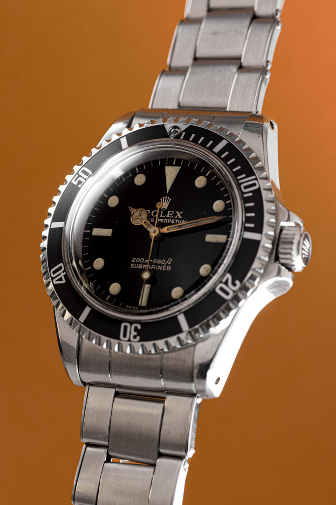
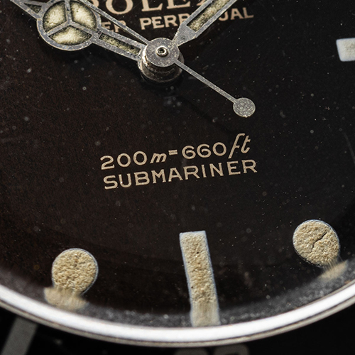
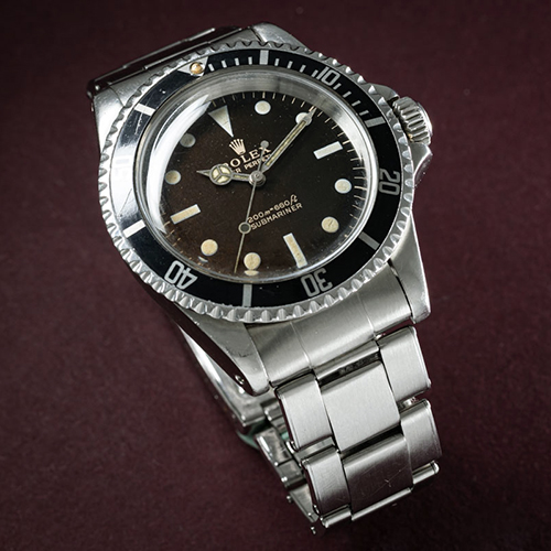
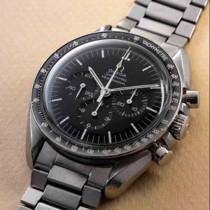
Rolex Submariner: a beautiful glossy gilt dial like you will only find during this period.
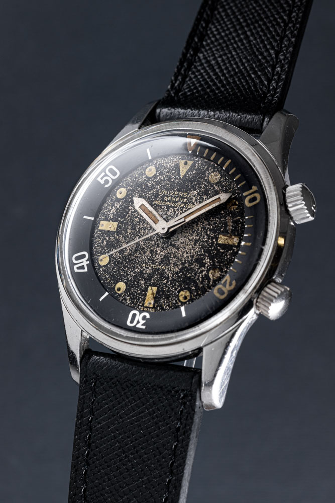
Universal Geneve: a gilt dial with stunning aging effects. The surface is evenly spotted, creating a beautiful blend of gold and black.
What it is not
Let’s get right to the point by killing off a widespread fable: a dial with gold-coloured printing is not a gilt dial.
You may spot phrasing like ‘gilt tone printing’ in descriptions of modern, often vintage-inspired watches. This usually refers to a dial with printing in gold, which instantly provides a bit of a vintage vibe, especially when compared to clean white printing. Gilt tone, however, is not gilt. And gilt is not necessarily gold-coloured. Modern gilt tone dials, then, are merely inspired by an archetype of actual gilt dials from the 1960’s.
Gold- coloured printing, that is clearly not a gilt dial.
Negative space
Simply put, a gilt dial is a dial in which the negative space has been coloured, rather than the actual text, logos, minute track and indices (what we would normally refer to as the dial printing). The process, however, is quite involved and is therefore no longer performed today. Honestly, we are still waiting for a brand to bring this technique back, since it is so visually attractive!
The process starts with a polished blank dial. This ‘blank’ is often brass, but can be any conductive metal. The first step is pad-printing the dial features in a clear lacquer. Pad printing allows for sharp printing on uneven surfaces, such as domed or textured dials. It is the industry standard technique for printing dials. The difference here is the use of a clear lacquer, rather than a colour.
Next, the dial with its invisible printing is galvanised or electro-plated in black. Since the black layer only sticks to the conductive surface, the clear lacquer remains uncovered. This means only the negative space is painted black. The result is a black dial with printing that looks like exposed metal, but is actually clear lacquered.
As you can see, this process differs dramatically from using gold paint on a painted base, which is how a gilt-tone dial is made.
Gold coloured gilt.
Copper coloured gilt.
Spotting a gilt dial
Since the features on a gilt dial get their colour from the exposed metal underneath, you will find different tones in practice. Most gilt dials are based on a brass blank, resulting in the typical gold-tone features. A silver-coloured metal, however, leads to silver dial features. This means that gilt dial text is not necessarily gold-toned.
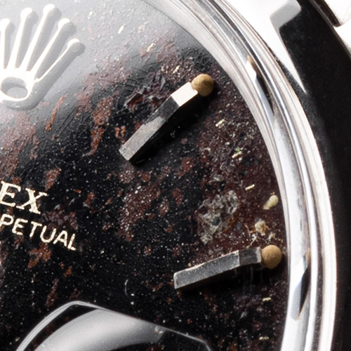
The first thing you might notice is the texture of a gilt dial. The galvanic painting process results in a glossy texture that is quite different from a gloss lacquered dial. It is a bit less glass-like, more metallic. Some of these dials have a tendency to discolour over time, resulting in brownish tones. This is often referred to as a tropical dial.
The printing itself has a metallic sheen to it. This makes sense, as you are looking at polished metal, rather than paint. Gilt dial printing is usually quite reflective and responsive to light. It is a little more lively than gold or silver printed features are.
Tropical dial detail.
Discoloured brownish tones.
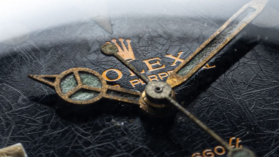
The biggest giveaway, however, is the layering of colours. This often requires magnification, a loupe, or even a microscope, to fully appreciate. You will find that a gilt-tone dial clearly features printing that lies on top of a base layer. The printing has some height to it. In gilt dials, however, the galvanised surface is often a bit higher than the clear-lacquered dial features. This means the text looks sunken into the dial. The black layer is often a bit thicker than the clear lacquer, showing that the printing is not on top of the black, but the black is rather ‘around’ the printing.
Rolex Date: multiple layering of colours aka "Camouflage tropical gilt".
If you spot the above, you can be certain you are dealing with a gilt dial. Sometimes, however, the clear lacquer is about the same thickness as the surrounding black. In such cases, the printing seems to have no height at all, not being lower nor higher than the surrounding black. Your eyes can deceive you. Is the text slightly raised? Or is it slightly sunken? Or neither? In such cases, it can require a bit of a trained eye or even more magnification to determine whether you are dealing with a gilt dial or merely gilt-tone printing.
Rare and desirable
Gilt dials were primarily produced in the early sixties. Stemming from a relatively short period in time, which also happens to be the absolute golden age of wrist watches (many higher end watches from the early 60’s are extremely desirable in any guise), you can imagine gilt dials are quite rare and sought-after.
And rightfully so. Gilt dials tend to have a depth and visual interest to them that you just do not find in regularly printed dials. It is the texture of the black, combined with the metallic sheen of the clear-lacquered features that is just so extremely attractive.
A gilt dial can commend a serious premium over a non-gilt version of the same watch. Just have a look at early Rolex Explorer, Submariner, and GMT Master examples with gilt dials. The price gap with later matte dials can be massive. The problem is, once you fall in love with the aesthetic of gilt, you are lost.
Want to see the gilt effect up close? Drop by our store at Reestraat 3 in Amsterdam. We usually have a couple of true gilt dials for you to behold.
We use cookies on our website to give you the most relevant experience by remembering your preferences and repeat visits. By clicking “Accept”, you consent to the use of ALL the cookies.
This website uses cookies to improve your experience while you navigate through the website. Out of these cookies, the cookies that are categorized as necessary are stored on your browser as they are essential for the working of basic functionalities of the website. We also use third-party cookies that help us analyze and understand how you use this website. These cookies will be stored in your browser only with your consent. You also have the option to opt-out of these cookies. But opting out of some of these cookies may have an effect on your browsing experience.
Necessary cookies are absolutely essential for the website to function properly. This category only includes cookies that ensures basic functionalities and security features of the website. These cookies do not store any personal information.
Any cookies that may not be particularly necessary for the website to function and is used specifically to collect user personal data via analytics, ads, other embedded contents are termed as non-necessary cookies. It is mandatory to procure user consent prior to running these cookies on your website.